Real Estate Photo & Video with Mary Giles

Mary Giles is one of the leading realtors in Erie County. With her extensive reputation, she's well known for her ability to sell homes quickly. Of course, quality photos and video of the homes is a really important part of this.

We've been working wither her for over 2 years to capture aerial photo and video for her clients.

The Summit - New Music Player

When we redesigned The Summit's website in 2023, one of the big things they wanted us to focus on was a brand new live music player on the site. Since The Summit operated two stations, we had to design a bespoke player from scratch that would allow the user to select which station they'd like to tune into.

In late 2024, The Summit decided to add a third station, Waveforms, to their production, so they reached back out to us to add this third station to their music player. This required an entire redesign of the music player from the ground up.

This new player uses a unified song and artist area on the right with selectable stations on the left instead of the previous "Island" design. This saves space. for both desktop and mobile to make it possible to fit all three stations on mobile devices.

The Chapel's 2024 Website Redesign

The Chapel in Sandusky, Ohio re-branded their church in 2020, right at the foot of the COVID-19 pandemic. At that time, a "branding to-do list" scribbled on a whiteboard in their office had the line item "Move Site to WordPress" on it. In 2024, we finally got to cross that task off their list!

Their were two main issues with The Chapel's previous site. First is that the site's backend was not set up appropriately to make managing the site simple, repeatable, or manageable. The second was that the site's navigation needed a complete overhaul.

Navigation is such a challenge for many nonprofits because they are known for covering such a wide array of topics and information. For The Chapel, that not only means having information about staff, locations, service times, and an archive of previous weekend messages. It also means having a calendar of events, information about study groups, ministries and volunteering, and even touching on outreach and partners. This complexity means finding a good way to organize a massive amount of information.

The project began in 2023 by first outlining all of the content and pages that needed covered and coming up with a rough sitemap. With over 60 pages in the initial sitemap, there was a ton of ground to cover! This sitemap was then condensed into a rough menu structure, and then the project was off to the races.

We then prioritized pages. Since not every page can get the same amount of attention, we selected about 10-or-so pages to focus on designs for, and then would design re-usable elements and structure for other pages on the site. The first of these was the menu design, which we wanted to keep compact but still full, so we decided to go with a hidden mega menu that reveals the menu structure. We structured the menu to follow the journey of a church goer by using verbs that would describe the path of someone learning about Jesus - Visit containing information for someone who may be attending church for the first time, engage containing information about how to get more involved with the church, and serve indicating how to take that next step and impact lives inside and outside of the church walls.

We designed customized templates and reusable components as well as a design language for the site that makes the site easily manageable and unites the style of all the pages on the site, keeping them consistent and reliable. We also implemented many custom solutions in the site, such as a script that automatically adds weekend messages to the site from their youtube channel, or a "Watch Live" page that automatically updates with the next livestream as they post it on their youtube channel. We also implemented an event manager to manage events, classes, and group meetings happening throughout the church and display them across the site.

This site is one major undertaking, and we only have plans to make it better in the future! A website like this is meant to live and breath and constantly change, and we're excited to see how this one will change over time.

Justyfi's "M.I.P" Music Video

When Aaron, also known as Justyfi, reached out to me once again with a Music Video idea, of course we had to entertain the concept.

The song, which focuses on many of the problems with rap culture, including drugs and violence, is fueled by Aaron's outlook on life, music, and his faith. As such, he wanted to steer the music video in a direction that pointed out many juxtapositions, where shots would be combining two unlike things, or symbolism would be used to point out interesting priorities in this particular lifestyle. Are you able to find all the symbolism in the video?

Stylistically, Justyfi had two visual inspirations for the style he wanted to emulate: Wes Anderson and Tyler The Creator. Wes Anderson's cinematography has a very "boxy" camera position where shots feel very intentionally placed, using a lot of centered shots and straight-on viewpoints. Many of Tyler The Creator's recent music videos also have a very warm, soft filmic look, with golden skin tons and punchy contrast. That became the primary inspiration for our color grade.

The video was shot over 3 days, with a shot list joint developed between Shoreline and Justyfi. On set, we used our Blackmagic Ursa Mini Pro and our Blackmagic Pocket Cinema 4K as our primary cameras, which are responsible for almost every shot in the video. Editing and Color was done in Davinci Resolve.

Justyfi's "Lose My Head" Music Video

As my friend Aaron, also known as Justyfi, wanted to begin releasing his first music project, he knew that he wanted a cool music video to pair with the project's release. He reached out to me with a specific vision for his song "Lose My Head" on the EP. The song, which focuses on Aaron's desire to keep his focus on his faith and relationships as he grows, rather than losing himself in the process. The song lends itself in both feel and lyrical content, with a trippy, dazed cadence and punchy, fast lyrics. Aaron's vision for the music video was an interrogation, where he would be interrogated by hooded figures which would only later be revealed to be versions of himself. Stylistically, Aaron wanted to video to feel very dark and cold. Even the outside portions he wanted to feel as though it were night time, so that the entirety of the video felt as though it was dimly lit.The music video was shot in under 18 hours, providing an intense shooting schedule that started Friday Evening with pickup shots early Saturday morning. However, the shoot being done in only two locations with minimal scene changes made it achievable in such a tight timeframe. The video was shot on our Blackmagic Pocket Cinema Camera 4K as well as our Panasonic GH5 for most of the video, with a few shots provided by a Sony A7S III. Our initial edit for the video was done in Premiere Pro, and then was transferred to Davinci Resolve for our fine tuning and color.

Canton Symphony Orchestra 2023/2024 Season Materials

Canton Symphony Orchestra reached out to us again to begin building materials for the 2023-2024 season. We've been working with them for years, so they asked us to handle their 2023-2024 season postcards, season brochure, and program book.

Their season is divided into 2 main sections, Masterworks and Pops, where there are 7 concerts and 4 concerts, respectively. Each of these needed a 4x6 custom designed postcard with the event's title and information. In addition to the 4x6, it was also necessary to include 4 additional sizes of each card to be used in other marketing efforts such as social media. Crucial to this set of postcards was a unifying feel in the design, so we selected a similar art style and a unifying bar on the bottom of the graphics for all ticketing information.

In addition to the original 4x6 Design, CSO requested multiple sizes of these cards in different dimensions for use on their website and social media. In total, we designed 55 cards.

Another major part of the CSO Season material is their brochure, which has frequently asked questions as well as general information about the overall season. This large brochure unfolds unto a 16-panel sheet, with 8 panels on each side. We designed this using a bright color palette with similar colors used in the cards, and a similar font to that used on the cards. We selected our title font to used Montserrat, with Playfair Display being our accent font. This combination allowed us to achieve a bold, punchy feel while maintaining the subtle, classy qualities that the previous season design had.

Finally, the season program book is meant to be a glimpse into everything going on at CSO for the season, from messages from staff as well as detailed biographies about every piece being played in their masterworks concerts, this is meant to be essentially a condensed version of their website all in a 100-page zine.

We maintained the color palette and font selection when it came time to update their website design. Building on the design we had already done last year, we updated their font selection to our new fonts, inverted the dark theme to a white theme, and swapped out their purple and subtle blues for our brightly inspired color palette. To tie it all together, we made use of a subtle paper texture that was used on all the season cards to make it feel cohesive.

R.E. Warner & Associates | Company Headshots

R.E. Warner has been providing Surveying & Engineering services for over 70 years. Recently, R.E. Warner has been going through a massive growth period, moving into new workspaces, and expanding their team to account for the change. As their team grew, they decided to refine their brand into something more modern and friendly. As a part of this rebrand, they wanted to get new headshots for all of their 75+ employees. REW brought us on for a two-day shoot. We put together a beautiful headshot setup that matched their new colorful and dynamic brand. In addition, we also took additional, more natural headshots of all their leadership so that they would have multiple options. We finished it off with some nice environmental photos from around their office.

The Summit FM's New Website

In January, The Summit FM based in Akron, Ohio reached out to us about their upcoming rebrand. This non-profit radio station was undergoing a process to revamp the image of the organization to a sleek, revised, modernized version of itself. Along with this brand update, they asked us to come alongside them to develop a brand new website.

Their old website was built in WordPress, but was created multiple years ago in a form that made it difficult to update. In addition, there were certain features of the site, such as the ads and the music archive, that didn't function any longer. Thus, there were a few goals that we set out to do when building the new site.

First, we wanted to stay on wordpress. Since they had already been operating on wordpress for a long time, it made a lot of sense to stick with it. It also provides a solid CMS for them to continually update the site, as one of the new features they wanted to implement was Summit Now, a form of blog where they could talk about all the things going on in the music world. Second, they wanted a way to show concerts and events going on in the area that improves on their old system, which was a google calendar embedded onto the page. Third, they wanted to get a functioning music archive and now playing system again, which existed on the previous site, but had ceased to function at some point. In addition to making the music archive function, they wanted to open it up to displaying more than a single day's worth of music history, which the old site could not do. Lastly, they wanted a music player to play what was live on the radio. So, we got to work.

The first stage of our process was to organize and prioritize all of our information, creating a game plan, schedule, and outline of what work would need to be done. We then began mocking up our design in Figma, to test out a number of different ideas for things like headers, menus, and more.

We also arranged what our rough menu layout would look like, determining what pages we needed to create and sending the team at The Summit off to begin writing any page copy that we would need.

We decided that features such as the music player and music archive, while important, were not core to the site's functionality. As such, we decided to schedule those as the final pieces of the development. The main bulk of work was developing the site, which was done in WordPress using a combination of custom code and pages built in Oxygen Builder and Kadence Blocks. The home page contains a number of unique features, including a custom-built radio schedule that displays the current content-block for the station based on the time of day, as well as the next few hours of station content. Also included is a list of upcoming events and recent sessions from the Summit's member's only concerts, Studio C Sessions.

When it came time to build the Music Archive, the first thing I did was examine the previous site's code to determine how it worked, and to see if I could understand why it stopped working. I discovered that the music archive was functionally intact, and was stored in a custom SQL table outside of wordpress. While the front-end of this code that would display it on the site wasn't functioning, the backend of the code which kept the archive database up-to-date had been functional the entire time, keeping a record of every song the station played from 2012-Now. I made the decision to re-develop a brand-new front-end for this system while reusing significant portions of the old back-end. While the previous front-end and back-end were both done in PHP, I wanted to do the new front-end in javascript to increase the flexibility. The existing backend also lacked comments for much of the code, so I went through the code and left comments as necessary. Included in this was a new method to fetch data by the date, allowing me to implement a date selection feature that could provide up to 2 weeks of viewable archive.

The final portion of this project was The Summit's music player. It is built using javascript that contains a state for both of The Summit FM's radio stations, The Summit and The 330. By default, a page loads with The Summit in a 'paused' state. However, the user can choose to 'play' either of the radio stations. If another station is paused or playing when the user presses play on the opposite station, the player automatically pauses the first station so they cannot play at the same time.

Overall, this was an incredibly complex and time consuming undertaking, but it was a mountain of fun and I'm so happy to have been a part of such an overhaul.
Canton Symphony Orchestra's 2022-23 Season Website Design

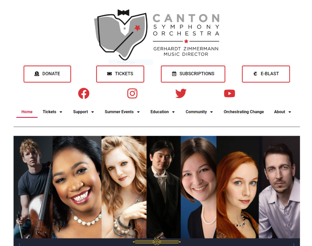
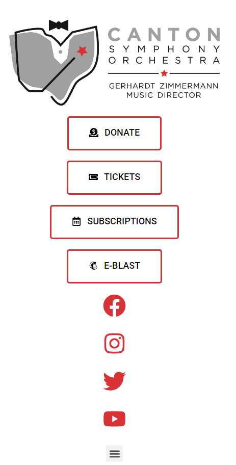
We've been hard at work over the past couple months, hustling to put together a brand new website brand for the Canton Symphony Orchestra. CSO approached me about creating some new website design for them as they entered into their new season. So, we got to work! We focused here on creating a new header, footer, and homepage, while leaving much of the rest of the site the same.

First, let's take a look at what the old site looked like and identify what problems they wanted to solve. Previously, the header was extremely large and took up way too much space. Sometimes, this was up to half of the screen on desktop devices and more than a full screen on mobile devices! This made it extremely difficult to properly utilize the site due to the large amount of scrolling necessary. Their logo took up a significant portion of the header, leaving massive amounts of white space around it. In addition, they had a very large menu that was always showing. All these different features combined created the intensely large menu. Their footer was no different. The logos of their sponsors took up an extremely large amount of screen real-estate, meaning the user has to do a lot of scrolling to see them. By downsizing everything, we could make the site more usable and friendly. Also, by hiding away some of the less immediately needed information, such as the mega menu, we could do even better. So, we got to work.

The first step in developing the website was to sit down and identify the core tenants of what we were looking for. We talked about the priorities of what needed to be on the site, what style they were going for, and what features they could utilize. We began numbering the elements on their previous page in terms of priority, starting at 1 for most important and going downwards from their. This is a good exercise to determine where things need to be visually placed on the site to make things effective. If you have things that aren't important, they shouldn't be taking up significant amounts of real-estate. So the exercise can tell us where we need to draw the line. For CSO, the important things were the 4 buttons they originally had in their header, as well as their logo, which needed to remain large enough to read. Stylistically, their 2022-2023 brochure had a very 'Art Deco' theme and they wanted the website to have a similar feel. This lead us to using a combination of a serif font for headers and a sans-serif font for non-headers. We made use of a lot of thin bordering and dark colors to make a very high-contrast look that exhumes some of the same feel of the brochure. With our look decided, it came time to develop.

Their site was currently built using Elementor, which is not typically what we build our websites with. However, they specifically requested that we stick with Elementor as much as we can, so we went ahead and began creating everything within Elementor. This includes the Mega Menu, fly-out javascript and more, all done natively.

There was one last piece that they wanted us to do. That was a loading screen that utilized a short animation that we had made for them in a video we did in the past. They thought it would be great to see this animation upon visiting the site. So, I converted the animation to a GIF and added a small WordPress Plugin to allow that animation to play on the load of the site!

Overall, we're extremely proud of what we were able to do for the Canton Symphony Orchestra here, and we're excited for them to head into their brand new season. Especially with a fresh new look to go with it.

Great Lakes Wealth Management - Branding Refresh

Great Lakes Wealth Management, owned and run by Wayne Maslyk in Sandusky, Ohio, has been around for multiple decades, helping people prepare for retirement, as well as helping retirees manage their retirements. When it came time to renew his old logo, he knew that he wanted to keep a similar, iconic lakeside feel, and more so just refresh it. So we approached it with the idea that it was not a total re-design of the logo, but instead just an adjustment. First thing we had to do was re-make the old logo, as it hadn't been updated in years, so all we had to work on was a couple of low-quality images of it. We re-created the old logo from those images, and then worked to soften the edges and make it feel a little smoother. We then picked out a brand new color palette that we based off of his old one, paring a beautiful yellow and blue that go great with white. We finished it off with a new font pairing, and a variety of layout options. This new logo has been in use all over the area on local TV stations and in local magazines and flyers. What an awesome little project!