Canton Symphony Orchestra 2023/2024 Season Materials
Canton Symphony Orchestra reached out to us again to begin building materials for the 2023-2024 season. We've been working with them for years, so they asked us to handle their 2023-2024 season postcards, season brochure, and program book.
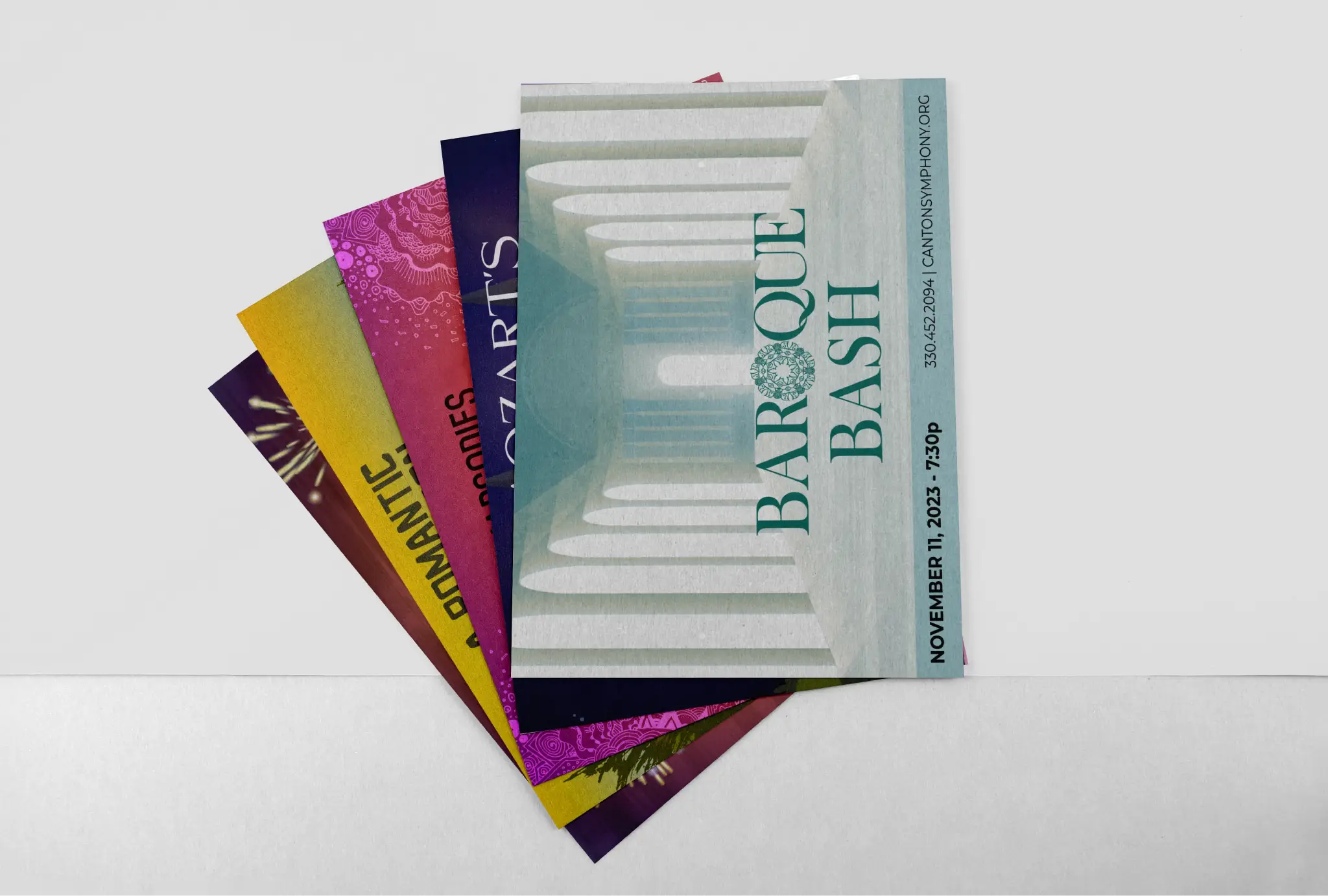
Their season is divided into 2 main sections, Masterworks and Pops, where there are 7 concerts and 4 concerts, respectively. Each of these needed a 4x6 custom designed postcard with the event's title and information. In addition to the 4x6, it was also necessary to include 4 additional sizes of each card to be used in other marketing efforts such as social media. Crucial to this set of postcards was a unifying feel in the design, so we selected a similar art style and a unifying bar on the bottom of the graphics for all ticketing information.
In addition to the original 4x6 Design, CSO requested multiple sizes of these cards in different dimensions for use on their website and social media. In total, we designed 55 cards.
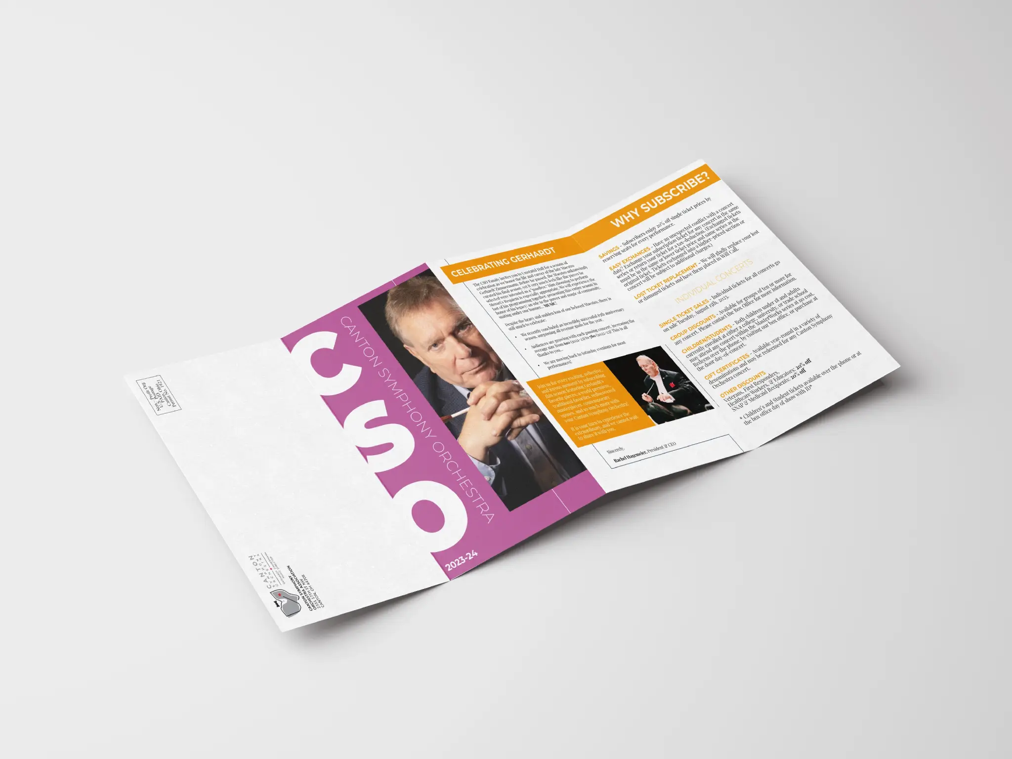
Another major part of the CSO Season material is their brochure, which has frequently asked questions as well as general information about the overall season. This large brochure unfolds unto a 16-panel sheet, with 8 panels on each side. We designed this using a bright color palette with similar colors used in the cards, and a similar font to that used on the cards. We selected our title font to used Montserrat, with Playfair Display being our accent font. This combination allowed us to achieve a bold, punchy feel while maintaining the subtle, classy qualities that the previous season design had.
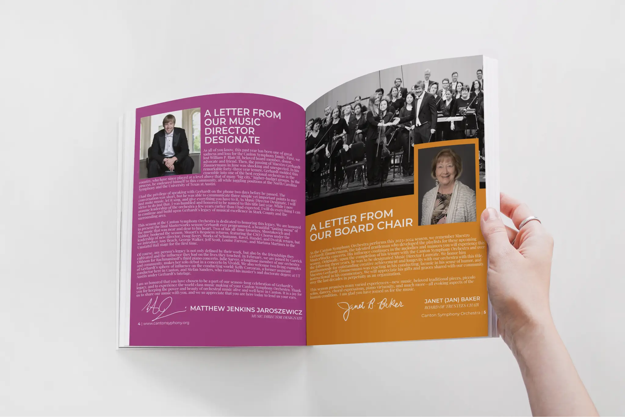
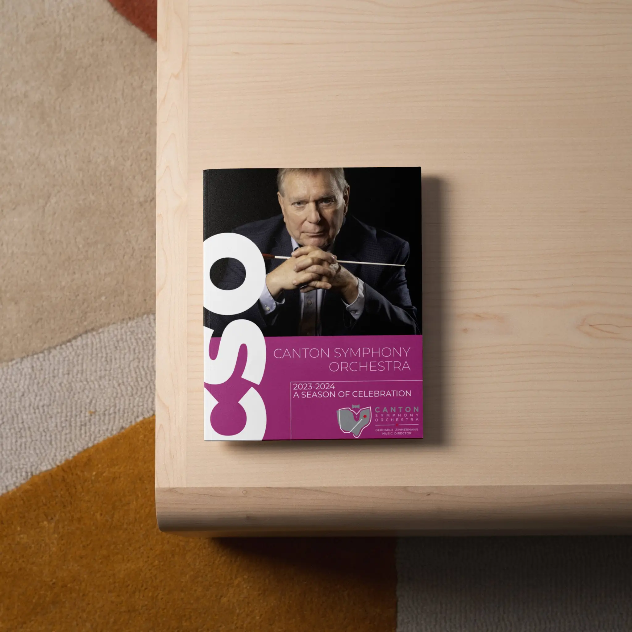
Finally, the season program book is meant to be a glimpse into everything going on at CSO for the season, from messages from staff as well as detailed biographies about every piece being played in their masterworks concerts, this is meant to be essentially a condensed version of their website all in a 100-page zine.
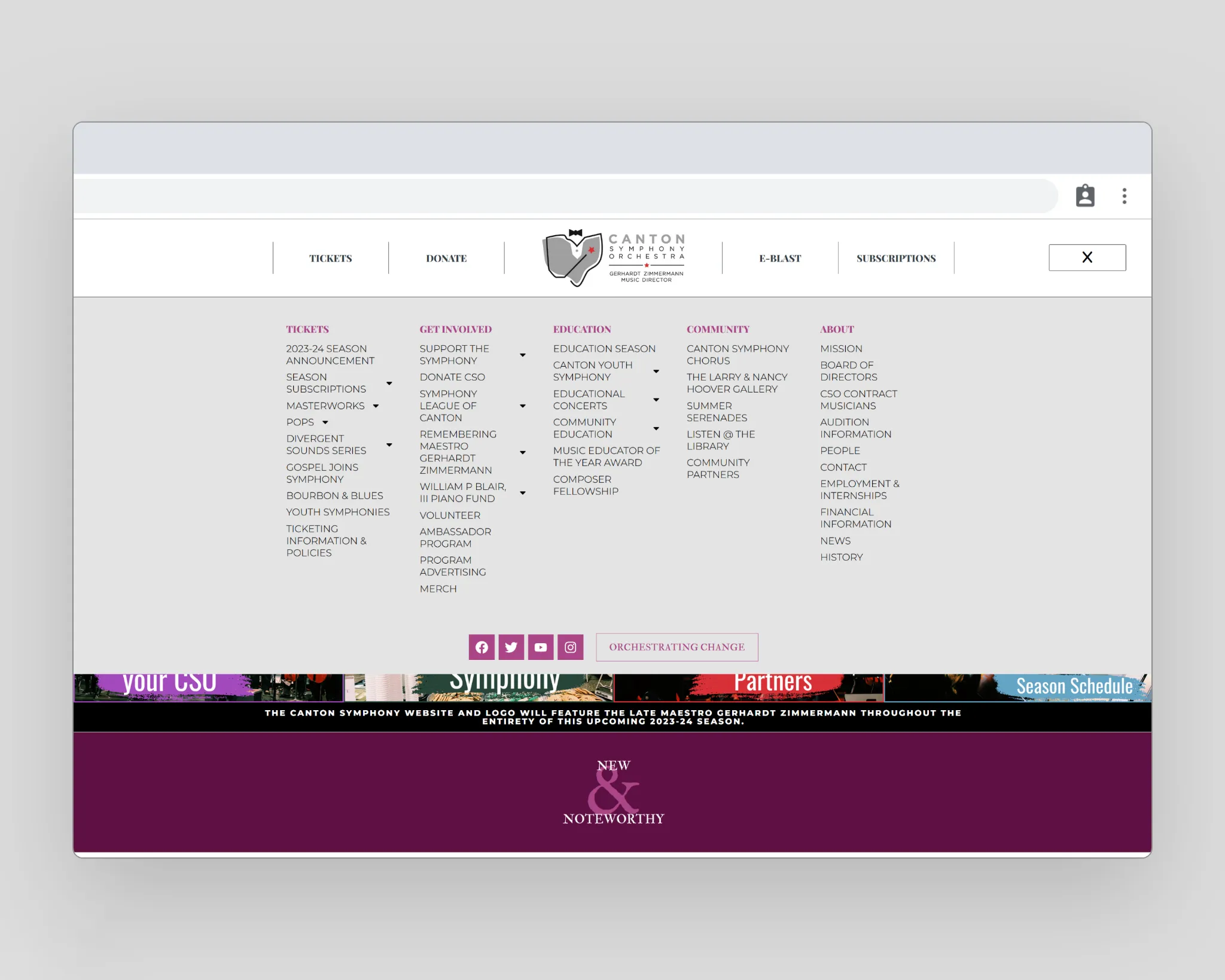
We maintained the color palette and font selection when it came time to update their website design. Building on the design we had already done last year, we updated their font selection to our new fonts, inverted the dark theme to a white theme, and swapped out their purple and subtle blues for our brightly inspired color palette. To tie it all together, we made use of a subtle paper texture that was used on all the season cards to make it feel cohesive.
