
Canton Symphony Orchestra's 2022-23 Season Website Design
We've been hard at work over the past couple months, hustling to put together a brand new website brand for the Canton Symphony Orchestra. CSO approached me about creating some new website design for them as they entered into their new season. So, we got to work! We focused here on creating a new header, footer, and homepage, while leaving much of the rest of the site the same.
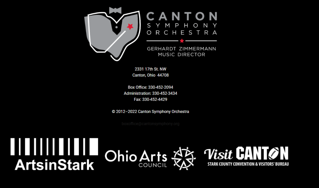
First, let's take a look at what the old site looked like and identify what problems they wanted to solve. Previously, the header was extremely large and took up way too much space. Sometimes, this was up to half of the screen on desktop devices and more than a full screen on mobile devices! This made it extremely difficult to properly utilize the site due to the large amount of scrolling necessary. Their logo took up a significant portion of the header, leaving massive amounts of white space around it. In addition, they had a very large menu that was always showing. All these different features combined created the intensely large menu. Their footer was no different. The logos of their sponsors took up an extremely large amount of screen real-estate, meaning the user has to do a lot of scrolling to see them. By downsizing everything, we could make the site more usable and friendly. Also, by hiding away some of the less immediately needed information, such as the mega menu, we could do even better. So, we got to work.
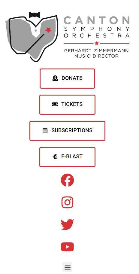
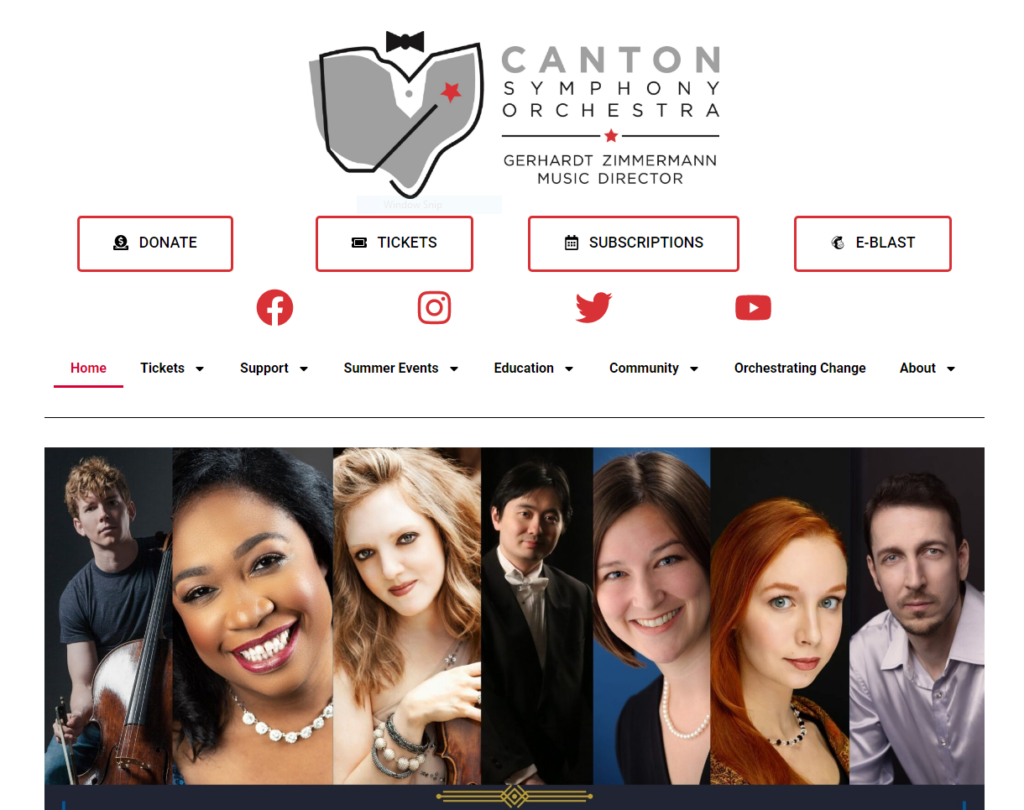
The first step in developing the website was to sit down and identify the core tenants of what we were looking for. We talked about the priorities of what needed to be on the site, what style they were going for, and what features they could utilize. We began numbering the elements on their previous page in terms of priority, starting at 1 for most important and going downwards from their. This is a good exercise to determine where things need to be visually placed on the site to make things effective. If you have things that aren't important, they shouldn't be taking up significant amounts of real-estate. So the exercise can tell us where we need to draw the line. For CSO, the important things were the 4 buttons they originally had in their header, as well as their logo, which needed to remain large enough to read. Stylistically, their 2022-2023 brochure had a very 'Art Deco' theme and they wanted the website to have a similar feel. This lead us to using a combination of a serif font for headers and a sans-serif font for non-headers. We made use of a lot of thin bordering and dark colors to make a very high-contrast look that exhumes some of the same feel of the brochure. With our look decided, it came time to develop.
Their site was currently built using Elementor, which is not typically what we build our websites with. However, they specifically requested that we stick with Elementor as much as we can, so we went ahead and began creating everything within Elementor. This includes the Mega Menu, fly-out javascript and more, all done natively.
There was one last piece that they wanted us to do. That was a loading screen that utilized a short animation that we had made for them in a video we did in the past. They thought it would be great to see this animation upon visiting the site. So, I converted the animation to a GIF and added a small WordPress Plugin to allow that animation to play on the load of the site!

Overall, we're extremely proud of what we were able to do for the Canton Symphony Orchestra here, and we're excited for them to head into their brand new season. Especially with a fresh new look to go with it.


